Mobile-first index: accelerated mobile pages project
23 February 2018 Leave a comment ALL-HANDS SEO, ON-PAGE SEO
Living in the world full of technologies, communities are increasingly using mobile phones and other mobile devices. The most crucial point is that no one can imagine their lives without technologies.

It has been pointed out that the biggest part of traffic comes from mobile phones, and almost 60% of traffic is driven by mobile users. Due to this fact, Google has announced to launch the Mobile-First Index. But do we know what exactly is Mobile-First Indexing? RankActive will shed light on it.
First time when we hear about mobile indexing, we barely can understand its real meaning; although, there is nothing complicated about it. Over the past years, Google has noticed a growth of accessing websites from mobile devices; hence, they have decided to implement a new strategy to web users – Mobile-First Index. It means that Google will be giving a preference to mobile-friendly pages. As more searches appear on them, Google will be more concerned about its index to be ranked.
A page’s ranking is highly essential in the world affairs, and particularly in SEO and digital marketing. Logically, it means that those who optimize their contents with a mobile device are more bound to be ranked than those who do not. We may say that indexing is a way to a successful web page and a step towards better rankings.
What is mobile friendliness?
No need to take a term “friendliness” closely. It is apparent that some websites seem to be loading slowly, and other websites demonstrate a good content and page’s value. This is what Google consider as a friendly page. Mobile optimization should be a priority for SEO experts to enhance a website’s progress. So, any page that reveals a proper content without lagging or does not demonstrate other critical issues can be easily called mobile-friendly.
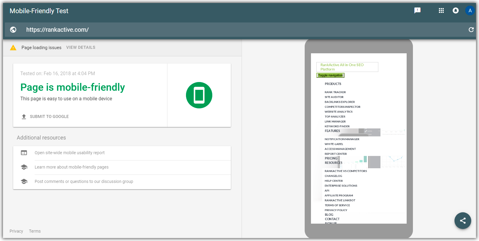
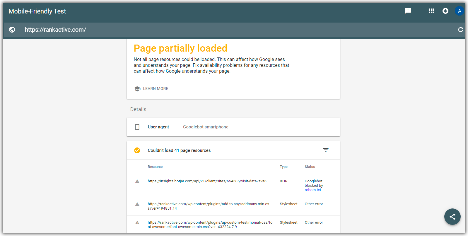
Every user can check whether a particular page is mobile-friendly or not. All you have to do is run a Mobile-Friendly Test: just type in the URL of the web page, and get the results. Once you get a checkout conclusion, you can analyze website’s issues and fix them according to the output of the test.
Google takes on board mobile-friendly pages and ranks them above non-mobile-friendly pages. So, what are the tips to make a web page “friendlier”? There are some options to be considered:
- Decrease the size of the content. Obviously, long articles are important and consist of many various features, but it is hard to read a large number of words on a mobile device. Therefore, it is recommended to shorten the text to make it more readable, but keep the amusement of the content at the same time.
- Variable content. SEO and digital marketing texts should pull up the audience not only by constant words but also by adding graphs, videos, audios, etc. A mobile user will be even more interested in reading your content if there are some imagery and graphical stuff.
- Implementing a mobile-friendly test API. It helps users to understand whether a site is mobile-friendly or not.
But this is only a part of the understanding of Mobile-First Index, so, you should consider the fact that mobile-friendly approach is highly important regarding the Google’s rollout strategy.
What if there is no mobile website?
Despite the fact that Google requires for web users to launch mobile web content, it won’t be a big deal for those who still don’t have mobile websites. Certainly, they are not going to cross out a desktop content just because you don’t have a mobile version, although it will improve rankings. Google pointed out, “If you only have a desktop site, we’ll continue to index your desktop site just fine, even if we’re using a mobile user agent to view your site.”
How to solve issues with high load time?
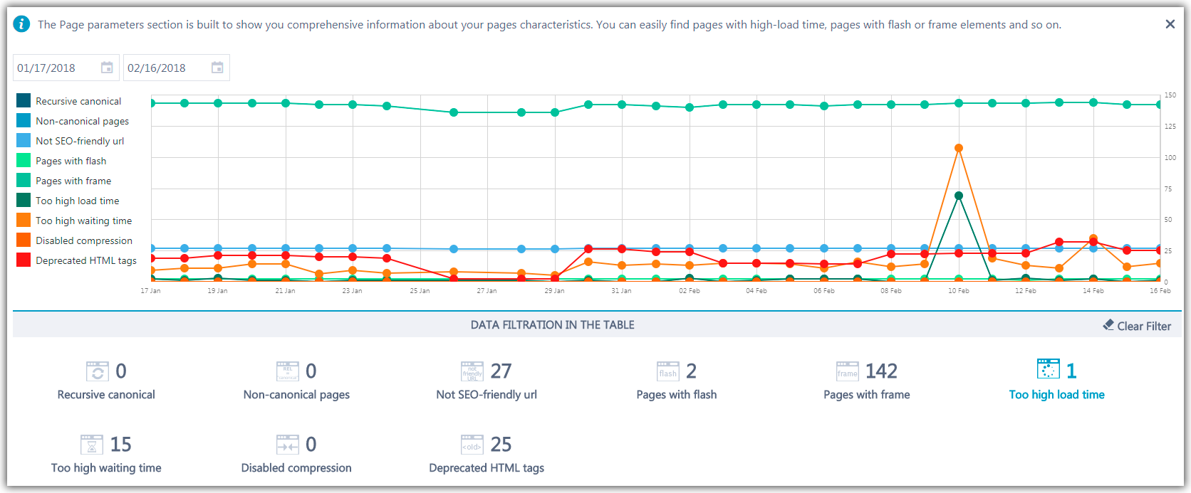
RankActive provides the overview of the crawling diagnostics. It gives a set of errors, warnings, notices, and dynamic charts. Scanning helps to follow a page’s performance along with SEO progress. Let’s look at the following example:
As we can see, there are some issues which have to be solved. High load time makes a non-mobile-friendly page; consequently, such website is unlikely to get high rankings. Too high load time can be a result of including flash and frames, and we can see the analysis above which detected such issues.
Using frames can be a nightmare for SEO because frames load a website as a single page; hence, search engines consider your content as unchangeable. Moreover, frames are bad for mobile devices because they prevent users from viewing a page fully. The only solution is using inline frames. Iframe allows redesigning a content without changing HTML.
Regarding flash, it is bad for SEO as it prevents search engines from accessibility and using HTML. Flash may be good for online games, but it makes a page load slow, asks for a plugin, and decreases a website’s usability. Mobile users are bound to be annoyed because most of the mobile devices do not support Flash; and consequently, it doesn’t provide a mobile-friendly page.
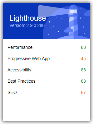
A web page’s quality is to be properly ranked by Google; hence, there’s another option to improve the quality of websites, – by Lighthouse. It is an open source browser extension which allows users to check out their pages. There are many options to be audited: performance, accessibility, SEO, etc. Let’s check out this analysis of Google as an example:
Nevertheless, it’s worth noting that both desktop and mobile web pages should have the same content for a precise ranking by Google.
What if desktop traffic is much wider than a mobile version?
Perhaps it can be a problem as Google is seriously considering to launch Mobile-First Indexing in the nearest future. However, it is still unknown when the new approach will get live. Gary Illyes, head of Google search, said, “We don’t have a timeline for the launch yet. We have some ideas for when this will launch, but it’s probably many quarters away. Our engineers’ timeline was initially end of 2017. Right now, we think more 2018.”
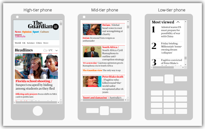
Both mobile and desktop contents should have the same traffic. Google has mentioned that mobile version is due to be essential according to their new strategy. Mobile-friendly pages are likely to be viewed on mobile devices than on the desktop. It means if a page on the mobile and desktop versions will be different, then it will be two different pages. Consequently, Google crawler will prefer considering the mobile version.To sum up, Mobile-First Index should be taken seriously as it’s going to be a worldwide phenomenon. You may see RankActive on different devices:
Well, we need to find out more about the ACCELERATED MOBILE PAGES PROJECT. Why? Well, because it is one of the most important ways for improving mobile content’s speed and rankings.
What is exactly AMP?
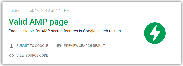
To begin with, AMP is an advanced program developed by Google and supported by other brands (e.g., Twitter, WordPress) in 2015 to make mobile pages’ speed faster and more efficient. You may say it is a stripped-down form of HTML or how they call it “diet” HTML (HTML5). It means that Google, Twitter, LinkedIn, and other organizations have decided to implement this form of HTML to load mobile pages faster. The new HTML page is designed to be lightweight and quick for responses from the mobile devices. AMP is a new project which helps users to load web pages instantly and thus gives an opportunity to create a mobile-friendly content for users. RankActive is not AMP page yet, but we can provide AMP Test to an official website of the project.
Does AMP seriously provide a fast loading?
The answer is an absolute “YES.” Still wondering why? Let’s imagine a website with an original HTML which takes forever to load the content from any mobile device. There are many doubts you would still wait until it is loaded to the full. But having a web page with HTML5, any mobile web page will be immediately loaded. It will increase chances to pull up a much bigger audience and enhance dynamic programming of the website. Simply put, the AMP icon on mobile devices helps users to find web pages that are loaded fast.
Google has claimed that Google Search identifies and indexes AMP pages to produce a considerable web experience. Google has also proved that a page using AMP is loaded within one second and it uses less data than pages without AMP. Above all, AMP page is the essential part of reliable results within the search optimization.
What is Google AMP Cache?
Many of web users are bound to meet the term Google AMP Cache in the Google world. Also, it is tightly connected to AMP itself. Simply put, Google AMP Cache provides copies of valid AMP pages published on the Web. Google AMP Cache serves a fast experience for users. Every year Google implements some modernizations such as:
- Improvement of the image quality and its efficiency.
- Validation of AMP content only in particular AMP format.
- Restriction of image dimensions to prevent website’s issues with poor browser responsiveness.
Most of AMP pages are cached only by Google AMP Cache; however, there are other caches which can also provide a valid recognition.
Will AMP encompass other websites?
In fact, Google is trying to launch the same AMP format to other web pages, and thus Google has announced a new AMP framework during the conference in Amsterdam in October 2015. It has mentioned that Email and other AMP Stories will use the AMP format. The major part of web content is viewed on mobile devices; that’s why Google is planning to roll out the same type of other websites which have interactive photos and videos, dynamic traffic, etc.
For instance, Google has stated that developers can use mobile-friendly AMP format for Emails to fasten the traffic and get a new email experience. There are many new relevant functions which allow users to make a schedule and get notifications about any news instantly. Aakash Sahney, product manager of Gmail, said, “With AMP for Email, it’s easy for information in email messages to be dynamic, up-to-date and actionable.”
Regarding AMP Stories, they are intended to be “bite-sized.” It means that the content will consist both of photos and texts. Google has noted, “AMP story content should be fulfilling and standalone.” Consequently, launching a new option of the AMP framework, it will appear in many web pages in a creative way of storytelling developed for mobile devices.
Conclusions
It is necessary to thoughtfully evaluate the concept of Mobile-First Index and Accelerated Mobile Pages for web experts. Google constantly tries to design new ideas, for mobile devices in particular. It is quite logical why Google wants to carry out new approaches in search optimization, various methods for improving mobile version, and efficient programming frameworks, which will increase a web page’s drive traffic, its dynamic growth, and overall vision of the website’s popularity.
Mobile devices are making a new turnover in the technological world because users prefer using mobile version more and more. It doesn’t mean that desktop content will lose its value, but it is necessary to have a mobile-friendly website, especially with Mobile-First Index.
Do you have a desire to be a true professional and be prepared for new changes and challenges? Create a mobile-friendly web page, provide a reliable content, undoubtedly use the AMP framework, and here you are – your mobile web page is on the top!
Tags:


