WHAT DESIGN MISTAKES CAN HURT SEO?
30 June 2017 2 Comments ON-PAGE SEO, TECHNICAL SEO
So, you have decided to create a website. It is only natural that you ask yourself: “Should I pay more attention to attractive design or focus on search engine optimization?”

1. Missing H1 tags
Although this topic is not very popular among web developers, we can assure you that it is not the rocket science.
H1 stands for Heading one. In plain language, this is the main heading of the page. Every web page is structured with the hierarchy that helps search engines to gather correct information and hereafter rank users accordingly.
If we look at a website as it was a book, H1 would not be its title. It tells potential readers whether the book’s content is relevant to their interests. For example, if you are looking for tips on how to cook lasagna and you come across the page entitled “How to cook delicious lasagna for your family dinner,” you will apparently read the article. On the other hand, if you see the title, “Why lasagna didn’t win the Oscar,” such page would almost surely go unheeded because it certainly won’t help you with your family night.
In most cases it is seldom easy or straightforward to find Header 1. It is usually the largest text on the page. However, we would like to assist you with finding H1 at any website.
To begin with, open any web page and follow our instructions.
Firstly, open the web page.
Next, view the source code.
To do this, use a shortcut for Chrome (PC): CTRL + U
If you are using MAC, go for: CMD + Option + U
Then press CTRL+F to locate the H1 tag.
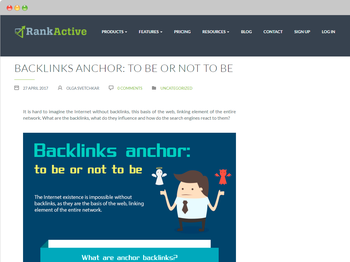
In this example, H1 tag is: <h1> Backlinks anchor: to be or not to be </h1>
After all these manipulations you will probably ask:
Why are H1 tags so important?
The answer is simple: Header 1 is one of the first elements to be overlooked by crawlers, and it helps search engines to determine the subject of the page’s content. H1 tag with a decent keyword can significantly improve your positions in search results.
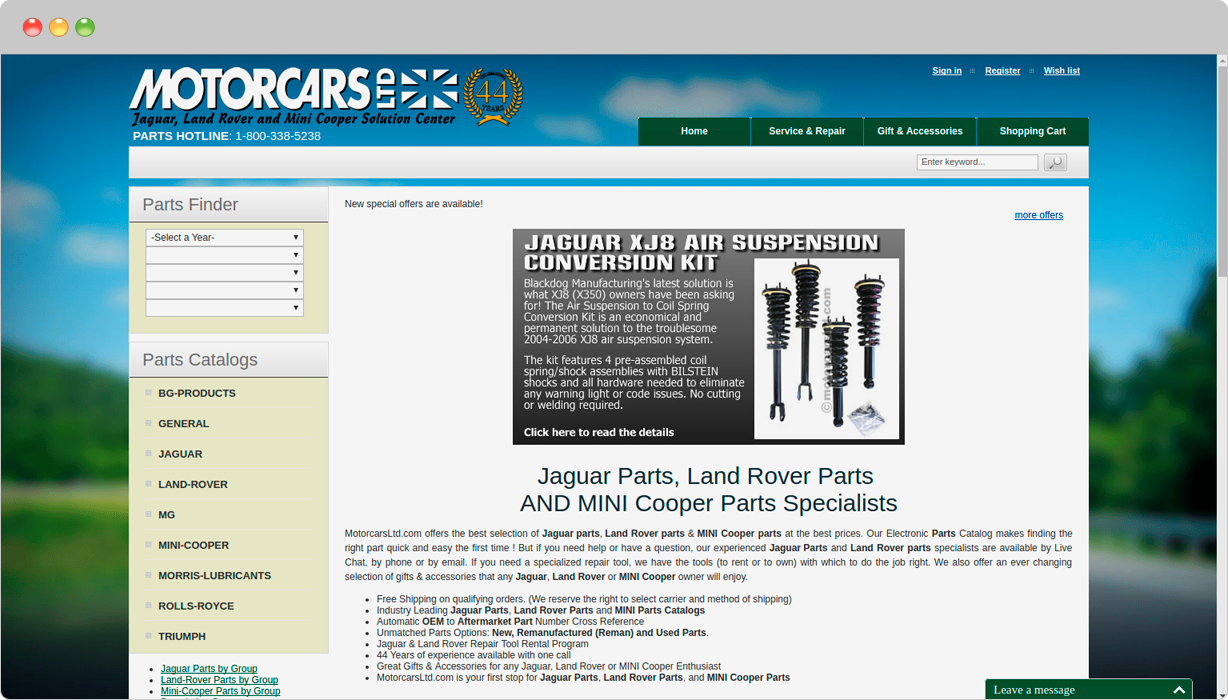
Here is an example of the website that has a clear H1 tag:
<h1> Jaguar Parts, Land Rover Parts AND MINI Cooper Parts Specialist”</h1>
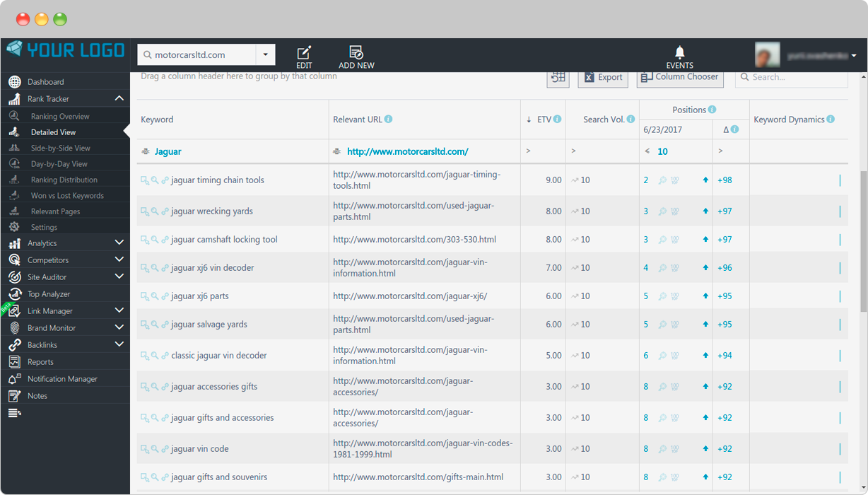
In this case, header one helps Motorcars Ltd rank in the top ten positions for many keywords related to its header “Jaguar Parts, Land Rover Parts AND MINI Cooper Parts Specialists.”
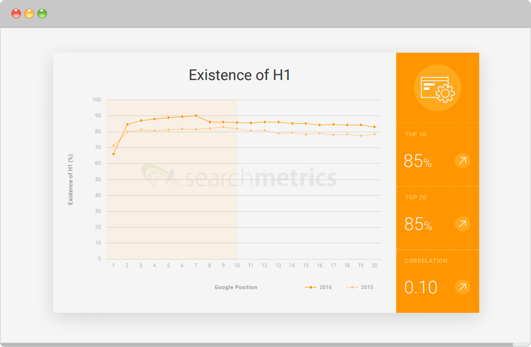
If you wish to explain to web designer how the website will benefit from H1 tag, you should introduce them to research on Rebooting Ranking Factors by Searchmetrics.
According to it, 85% of the first-page search results in Google use an H1.
So, now you see why you need to use Header 1 at your website. But how to use it properly?
Here are some tips on how to create decent H1 tags:
- Use only one Header 1 tag per page
- Header 1 tag should reflect the page’s content
- Header 1 tag should be big, strong and noticeable
Following these tips, you would hopefully increase the ranking of your website and make it good-looking and SEO friendly.
2. Images are a way too large
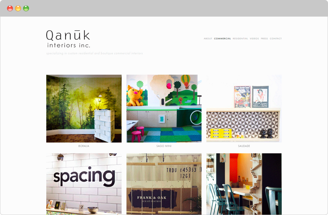
We have no doubt that pretty imagery makes your website look great. Nonetheless, you should understand that large images and media files may negatively affect the loading speed of your website. As a consequence, your rankings are getting worse, and sales go downhill.
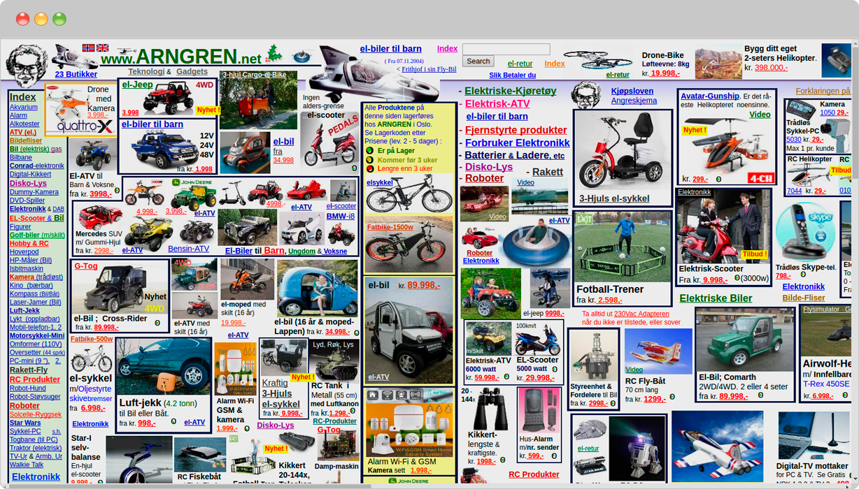
Here is a typical result of imagery abuse:
Horrible, isn’t it?
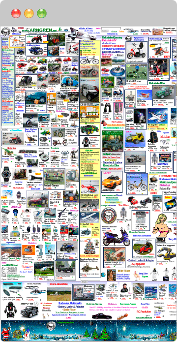
Let’s have a look at its mobile version:
Probably, users are not having a nice time surfing this website.
Following up on the survey by searchmetrics, websites ranked in TOP-10 do not have more than 2 images per page.
Moreover, it should be pointed out that Google rewards pages that load quickly.
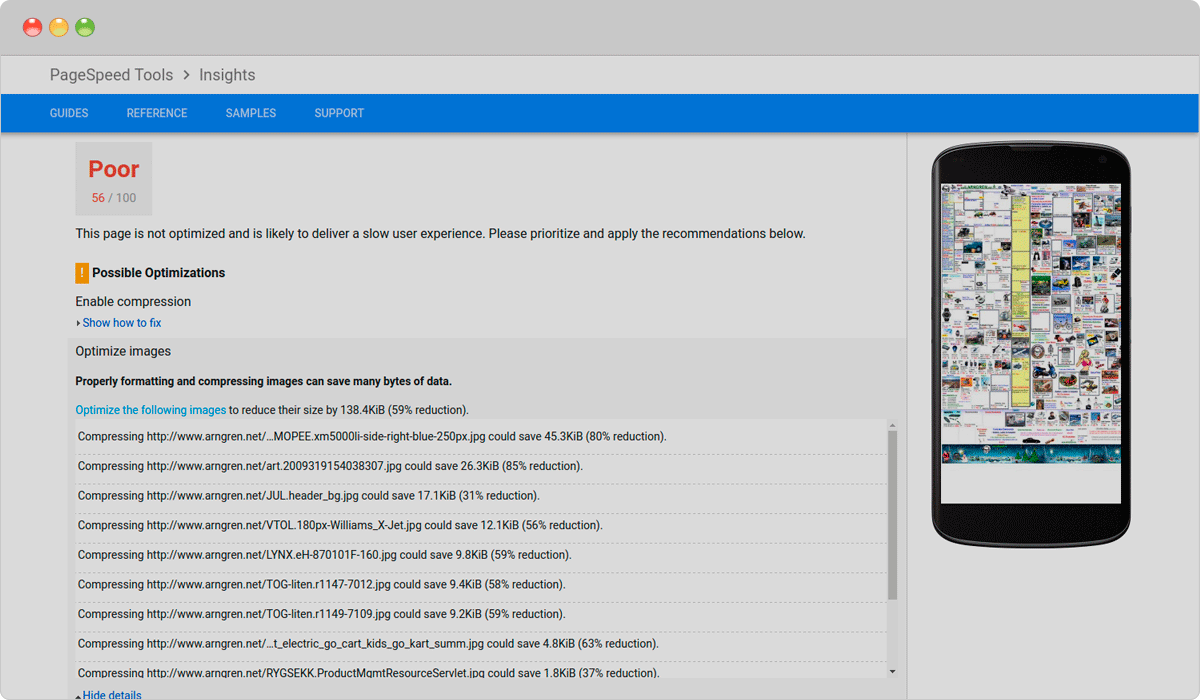
To check your website for large content that affects the site speed you can use free Google PageSpeed Insights Test that will tell you exactly what images are too large on the page.
The test shows that the page can be optimized by reducing the size of images by 59%.
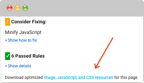
In addition to that, you can download optimized images directly from the Google PageSpeed Insights.
After downloading optimized content, you can re-upload them to your website and provide your users with the top-notch experience.
3. Interstitials
This year Google warned website owners that “pages where content is not easily accessible to a user on the transition from the mobile search results may not rank as high.”
Google claims to be concerned about user experience, especially on mobile devices. It is obvious that interstitials, pop-ups or whatever they are called prevent your website from exploring until you click on the particular link. So it is no surprise that Google finds them disruptive.
Here are three examples of interstitials that, according to Google, make content less accessible:
At the same time, if you follow the good pop-up strategy, your website would not be affected. For instance, Google recommends to use only those interstitials that appear to a response of cookie usage, age verification or occupy a reasonable amount of screen space.
4. Text in images
Surprisingly, this mistake is quite common among the websites. A lot of designers do not pay much attention to it, though. In fact, it may also have a negative impact on your rankings.
To begin with, search engines do not see the images as we do. Against this background, you should understand that search engines are not always able to recognize text on the image. Indeed, including text into an image instead of adding a text layer over an image, is the equivalent of not including text at all.
In addition to that, images are not vectors, so when zooming the text will become distorted. This wouldn’t happen if it was actual text. Moreover, text on the image cannot be translated with page translator services (such as Google translate), what can make the internalization of the website a way harder.
Here are some tips on how to mix text with images properly:
- Provide alt text for images. Simply assign images with alt attributes in HTML in order to provide search engines with a text description of your media content.
- Choose images that show a full sentence. A Subject of the image should be crystal clear, so it will not be difficult for users to understand the action being taken in the image.
- Do not provide important business information on the image. Placing your business contact details inside images on your footer is not a good idea since your potential customers will not be able to copy and paste this important info.
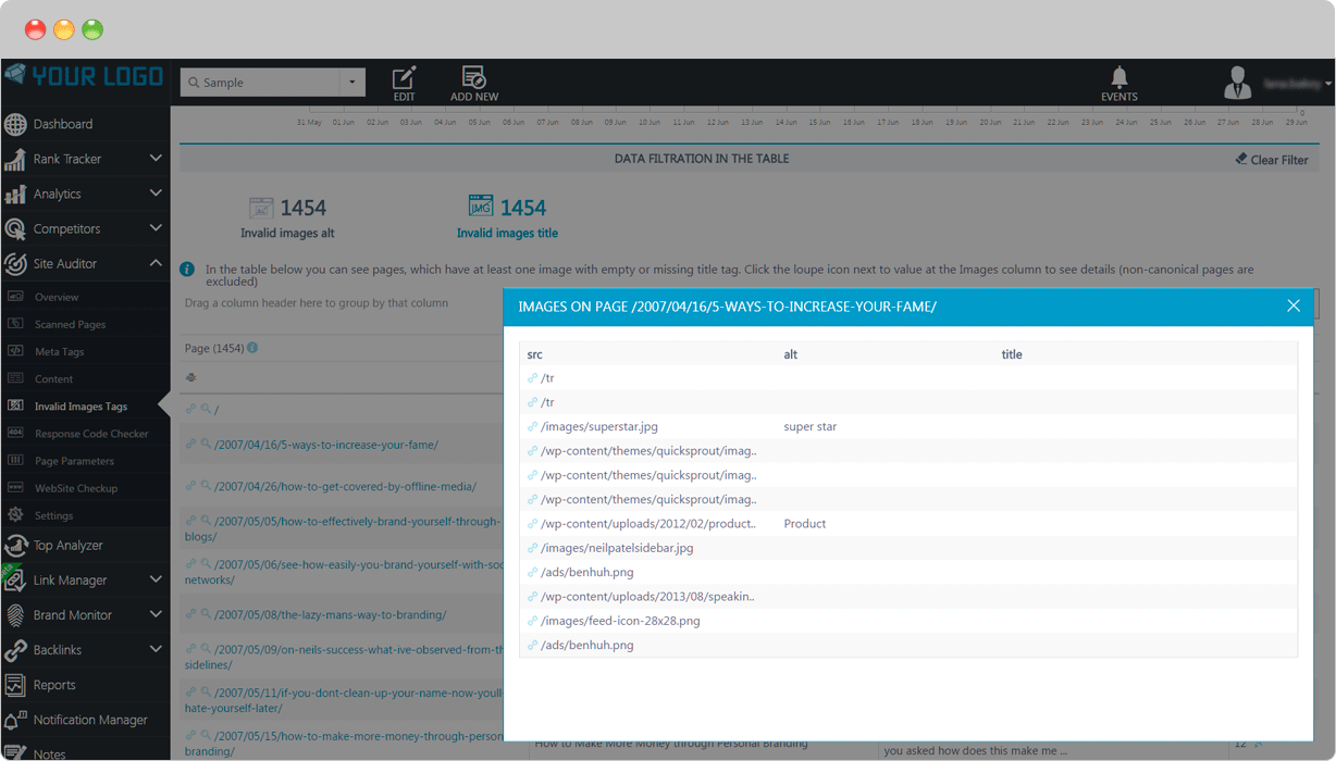
- Use special tools to find out how search engines view your website. For this purpose, you can use resources like Site Auditor from Rankactive. Moreover, by using such tools, you can easily locate all links and headings.
5. Infinite scroll
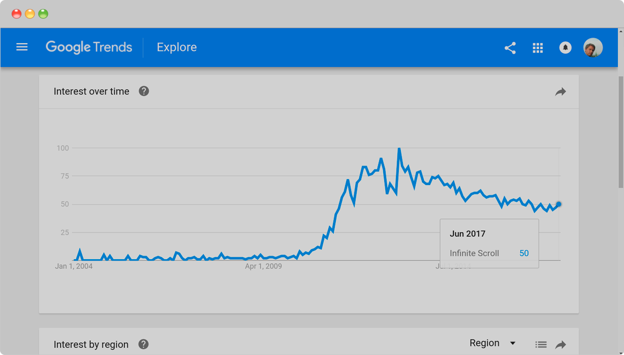
According to Google, infinite scroll remains trending as an interaction behavior on pages.
Social media websites with big amounts of user-generated content use it in order to provide their users with the most efficient way to surf that tsunami of information without having to wait for pages to preload.
For example, Twitter has implemented infinite scrolling successfully. From a user’s perspective, all tweets in the feed are equally relevant, so the user is likely to scroll down to the bottom. Since Twitter is a real-time platform, it’s feed updates instantly even if the user leaves it unattended.
Despite that, the infinite scroll does not suit every website on the Internet. For example, you have a blog with 300 pages, and you have decided to enable infinite scroll on it. Obviously, you do not want to show all pages at once. So you set some 10-20 pages to be displayed by default. And these default pages are the only ones that search engine robots are able to see. The reason for that is that crawlers parse websites through links so in this case, infinite scroll makes it impossible for them to discover that there is more content on the page beyond these 10-20 top articles.
If you still want to use infinite scroll at your website but do not want to compromise between design and SEO, we suggest you follow instructions Google Webmaster Blog provides.
All in all, infinite scrolling can be an innovative approach with a great impact on the interface. If visitors of your website are goal oriented, meaning they need to find specific information quickly, this feature is probably a thing that you are looking for.
6. Poor content
Apparently, pages containing information about your services and products are of the greatest importance for your website. Your success is prompted by your target keywords and rankings.
- The most common mistake related to poor content is the absence of product or service pages on the website. By doing so, you limit your ability to get organic rankings for your target keywords.
- The second mistake a lot of website designers make is listing all company’s products and services on one page. This can cause issues in ranking pages by search engines since they rank each page accordingly to its content.
7. Horrible 404 page
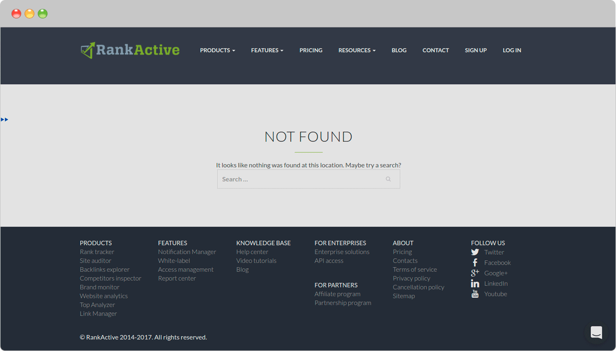
Nobody wants to lose your potential customers who might have visited a broken link on your website or just typed a wrong URL. Broken link without proper navigation can negatively affect the user experience. This, in turn, can lead to a loss of search rankings. In order to avoid it, use our tips on how to create an appropriate 404 page:
- Include a link to your home page
- Be creative
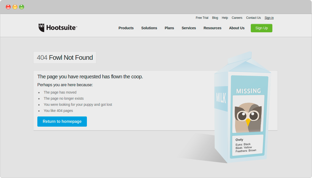
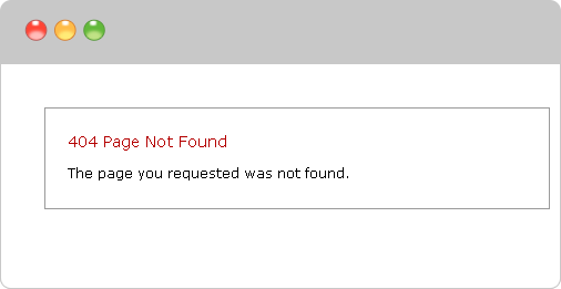
This is an example of boring 404 page:
It does not need to be this way, does it?
- Include a search engine that visitors can use to find the necessary information
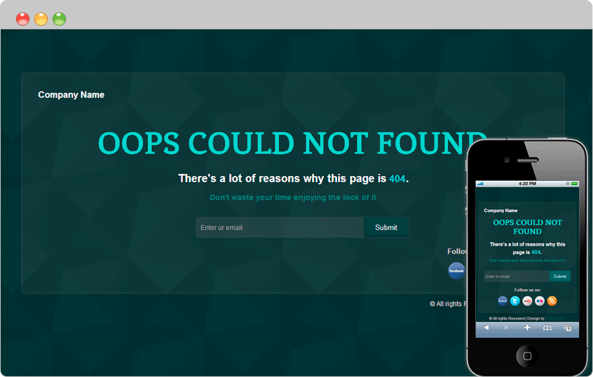
- Use an email link so visitors can report problems
While this approach is not very popular, it can be useful in building an e-mail list. As an example, one may take a template created by the team of W3 Layouts:
8. Using too much Flash
No doubts, Flash is visually good-looking and makes your website visually attractive. At the same time, it is not search engine friendly.
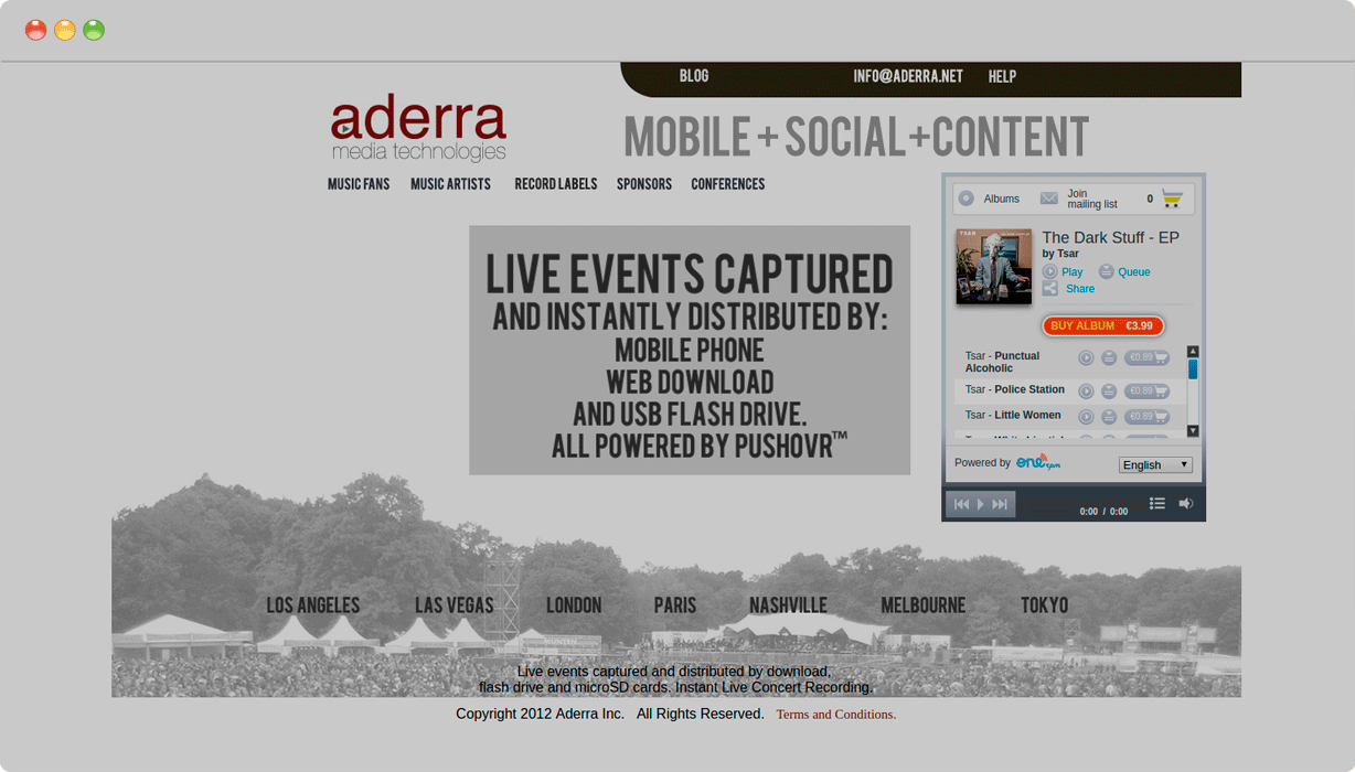
For instance, here is a typical flash-based website:
At least that is how we see it. But if we use Site Auditor from Rankactive to simulate the way the search engine sees it, we are not going to get any info. Why? Because crawlers do not “see” flash-based components. As a consequence, search engines will not index your content.
In addition to that, Flash does not work on many mobile devices. So, if you still want to use flash on your website, you should consider creating the dedicated mobile version besides the Flash-based desktop website.
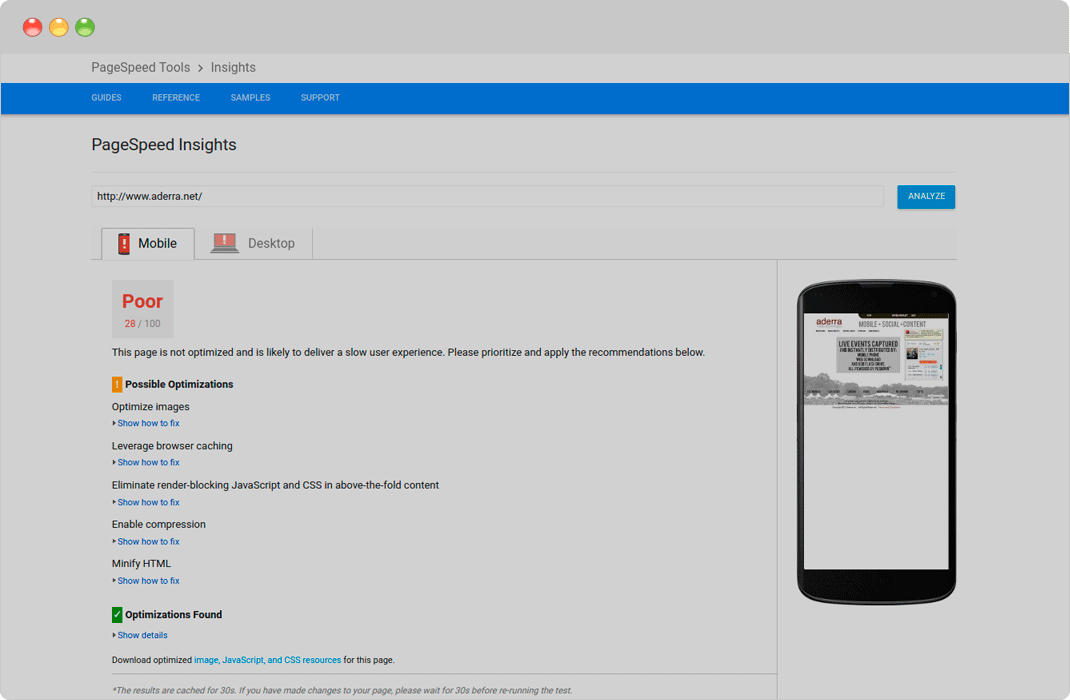
Moreover, even if Flash loads, it tends to load slowly. If we run Google PageSpeed Insights Test on the Flash-based website, it is highly unlikely to end up optimized:
For all these reasons, it becomes apparent that using Flash for websites is not a good idea. If your website has Flash-based content, we strongly recommend you to switch to alternatives like HTML5 for embedding videos on your website.
Conclusions
It is very important to focus equally on search engine optimization and website design. It does not matter if you are working on the new website or making a relaunch of the existing one, you should aim to maintain and improve your search traffic and rankings.
Tags:

